Tutorial 2: Matplotlib
This sections shows several examples how to use module Matplotlib. See module homepage for more tutorials, reference manual.
Basic graph
import numpy as np
import matplotlib.pyplot as plt

# data generation
x = np.linspace(-np.pi, np.pi, 100)
y = np.sin(x)

# display
plt.figure()
plt.plot(x, y)
plt.show()

# store figure
plt.savefig('fig.png')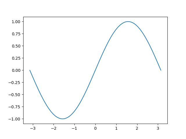
Labels
# axis labels
plt.xlabel('--> x')
plt.ylabel('--> y')

# axis borders
plt.xlim(-3.15, 3.15)
plt.ylim(-1, 1)

# title inc. LaTeX syntax
plt.title(r'y = $\sin$(x)')

# graph
plt.grid('on')
plt.plot(x, y, color='r')
plt.show()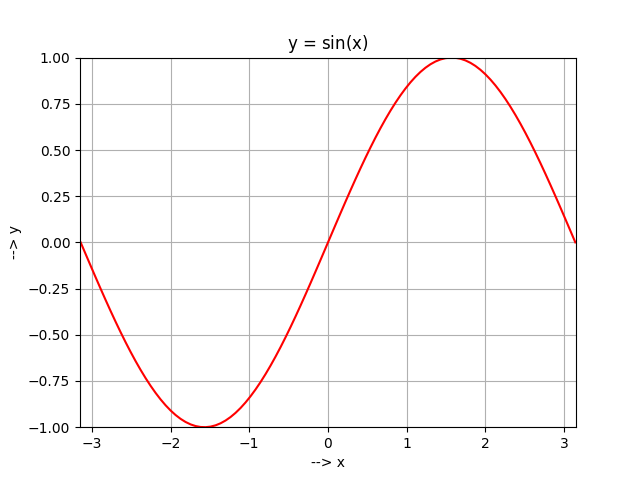
Multiple graphs
# graphs in single plot z = np.cos(x) plt.plot(x, y, label=r'$\sin$(x)') plt.plot(x, z, label=r'$\cos$(x)') plt.legend() plt.show()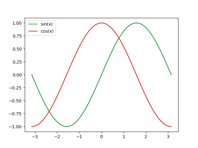 # subplots plt.subplot(211) plt.plot(x, y) plt.title(r'$\sin$(x)') plt.subplot(212) plt.plot(x, z) plt.title(r'$\cos$(x)') plt.show()
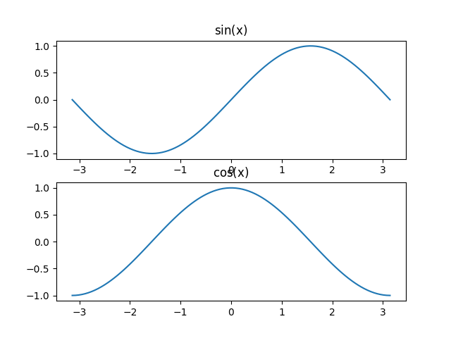
Special graphs
x = np.linspace(-np.pi, np.pi, 20) y = np.sin(x) # stem graph plt.subplot(211) plt.stem(x, y) plt.title('stem graph') # bar graph plt.subplot(212) plt.bar(x, y) plt.title('bar graph')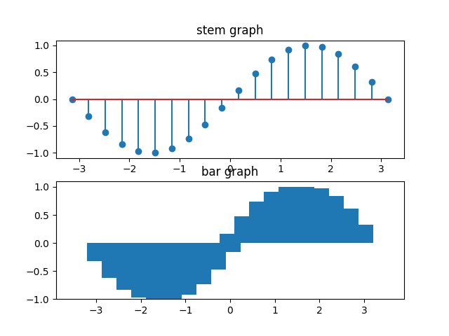 # scatter, non-correlated data x = np.random.uniform(-10, 10, 100) # uniform distribution (-10,10) y = np.random.uniform(-10, 10, 100) plt.subplot(211) plt.scatter(x, y) plt.title('non-correlated data') # scatter, correlated data x = np.linspace(-10, 10, 100) y = x + np.random.normal(2, 2, 100) # normal distribution, mean=2, standard deviation=2 plt.subplot(212) plt.scatter(x, y) plt.title('correlated data')
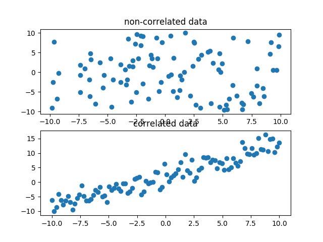 # histogram plt.subplot(211) plt.hist(y, 50) # 50 buckets plt.title('histogram') # boxplot plt.subplot(212) plt.boxplot(y) plt.title('boxplot')
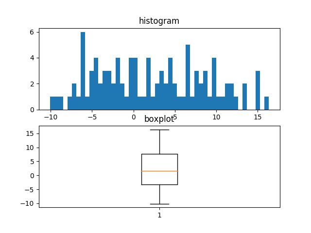 # pie chart x = np.array([10,30,40,15,5,10]) # percentage labels = ['item 1', 'item 2', 'item 3', 'item 4', 'item 5', 'item 6'] plt.pie(x, autopct='%1.1f%%', labels=labels, explode=[0.1]*6, shadow=True)
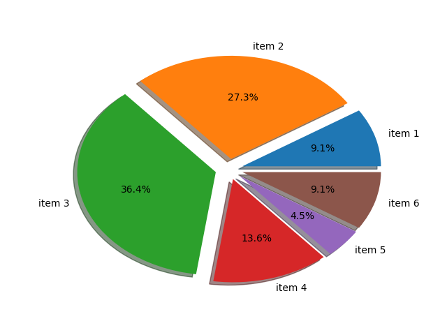 # polar coordinates phi = np.arange(0, 2*np.pi, 2*np.pi/120) # 120 samples rho = np.linspace(0, 1, len(phi)) # spiral plt.polar(phi, rho) plt.title('polar')
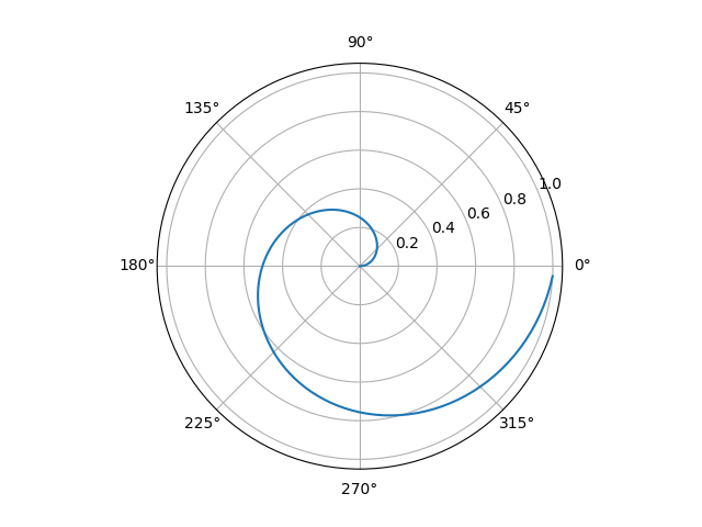 # contour x = np.arange(-1.5, 1.5, 0.1) y = np.arange(-1.5, 1.5, 0.1) X, Y = np.meshgrid(x, y) Z = X**2 + Y**2 plt.contour(Z, N=np.arange(-1, 1.5, 0.3)) plt.title('contour')
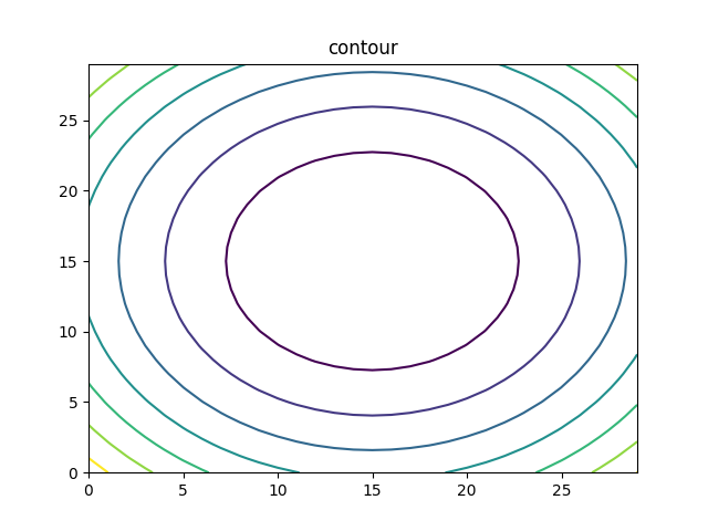 from mpl_toolkits.mplot3d import Axes3D # surface fig = plt.figure() ax = fig.gca(projection='3d') ax.plot_surface(X, Y, Z) plt.title('surface')
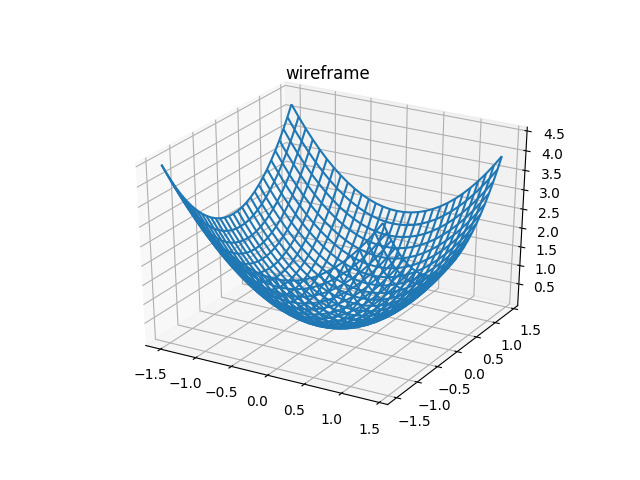
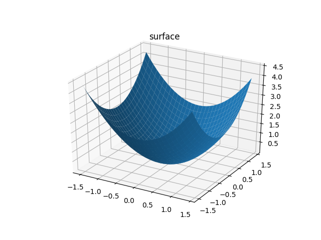 # wireframe fig = plt.figure() ax = fig.gca(projection='3d') ax.plot_wireframe(x, y, z) plt.title('wireframe')